DESIGNING THE KERI RESOURCE I WISH I'D HAD
AUTHOR /
JANET GONZALES
YEAR /
2026

I first got to know it during two years designing with GLEIF. Since then I've designed with the developers at healthKERI, built a wallet with Kaprion for the City of Dresden, and explained KERI to a lot of newcomers, product people and public servants who were curious but had no idea where to begin.
And honestly? I didn't know where to begin either, at first. I had to piece KERI together from repos, specs and recorded calls spread across a dozen different sites. So when Mark Scott asked me to help with the KERI Suite Knowledge Base (KSKB) ahead of the Internet Identity Workshop, I knew exactly who I was designing for. Past me. 😅
Mark had already done the hard part by gathering the best of KERI in one place. But everyone landed on the same dense index, and it read a lot like a spreadsheet.
When we talked it through, we kept coming back to three readers who were getting stuck:
1. The newcomer - A developer told to "look into KERI" gets specs, a glossary, repos and talks in no particular order. Missing: a place to start.
2. The veteran - They half remember a talk from two years ago and can't find it. Missing: one place, with addresses that last.
3. The non-specialist - A product owner or policy maker finds a vendor's page sitting right next to a specification, with nothing to tell them apart. Missing: a label on every item.
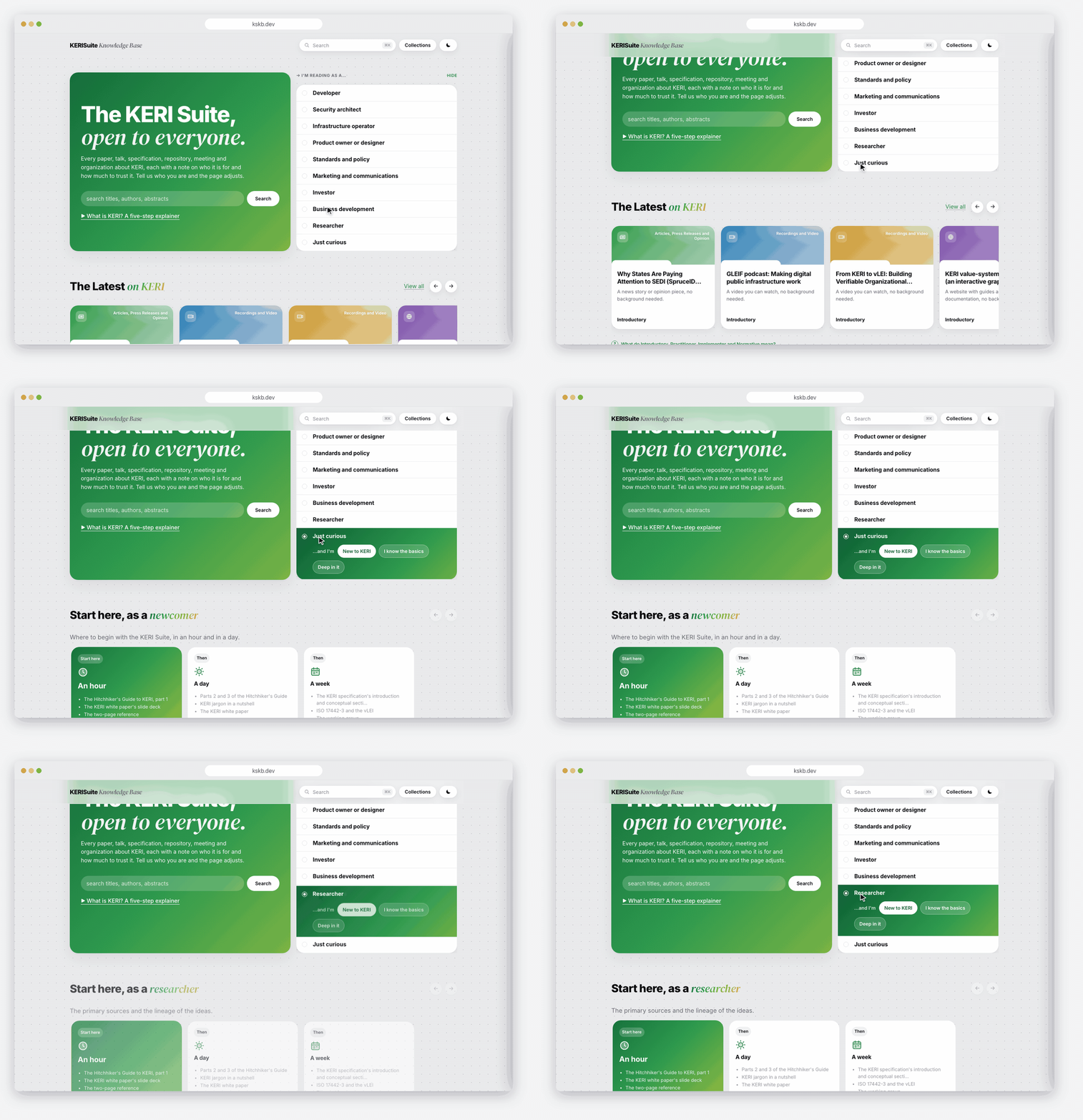
This is my favorite part. The home page now asks "I'm reading as a..." and rewrites itself for ten different readers, from Newcomer and Developer to Security, Product, Investor and Researcher - no reload, no sign-in. Each one gets their own Start here and their own version of The Latest, with a slow, staggered fade so you can actually see what changed.
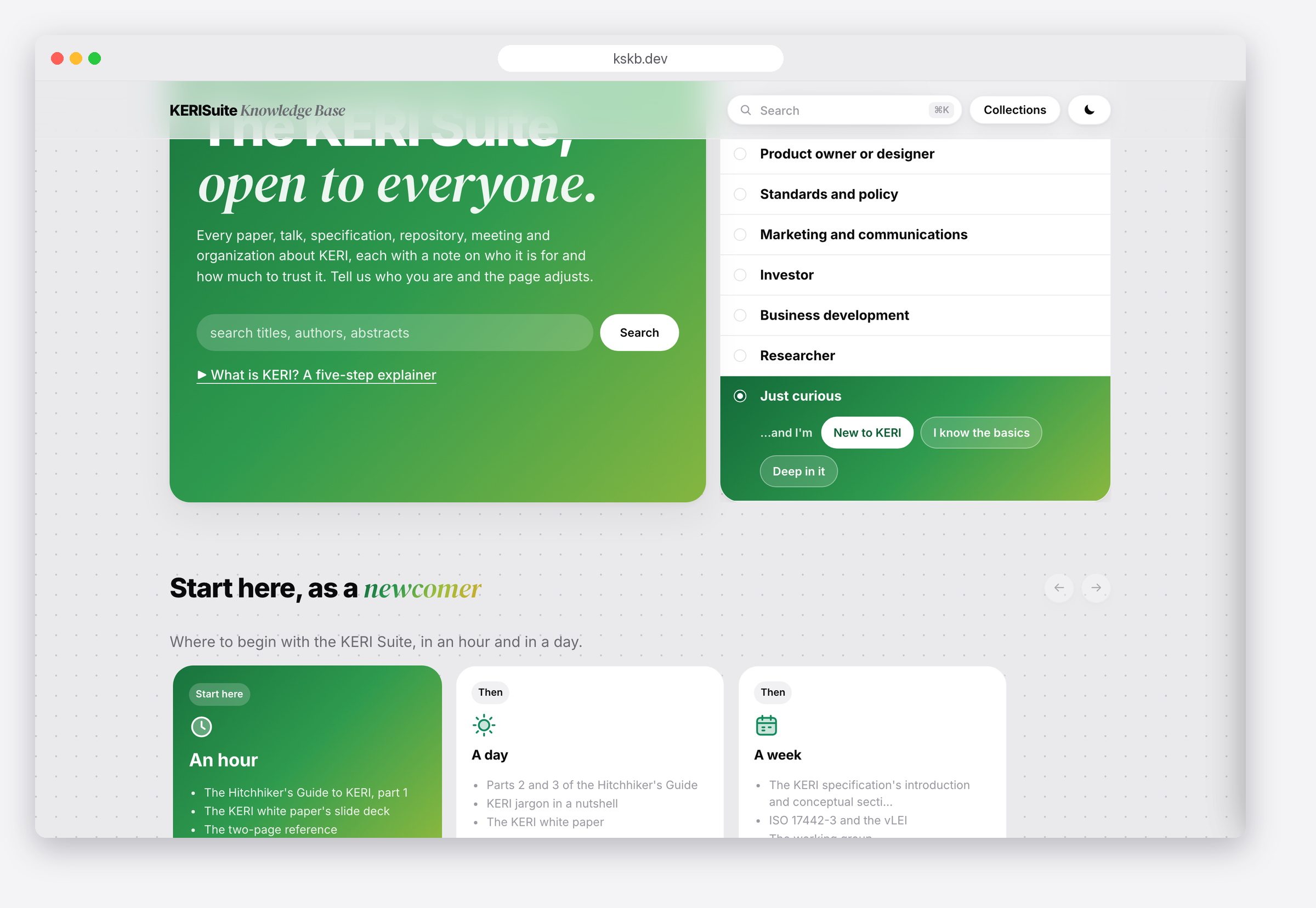
Newcomers get a clear first step, including a short five-step explainer of what KERI is and why it matters. The content came in a fixed format I couldn't change, so instead of rewriting it, I redesigned how people move through it. Same material, a lot more front doors.
Every source leads with two labels before any of the details:
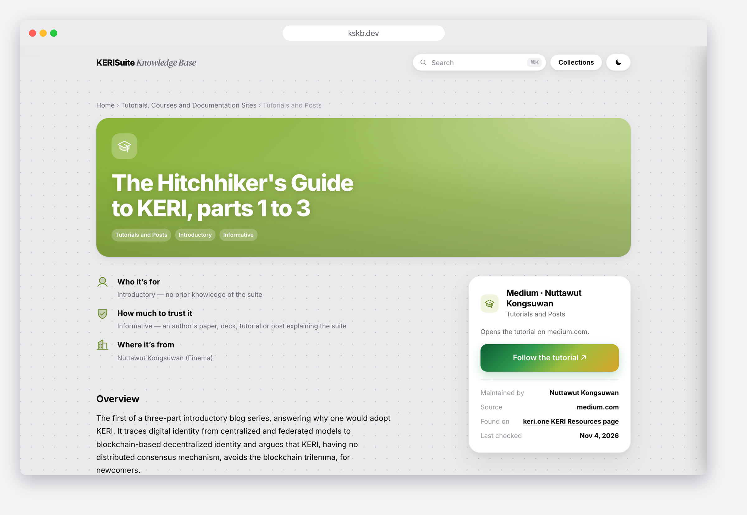
That second label is the one I think about the most. A vendor's claim and a specification shouldn't look the same, and now they don't.
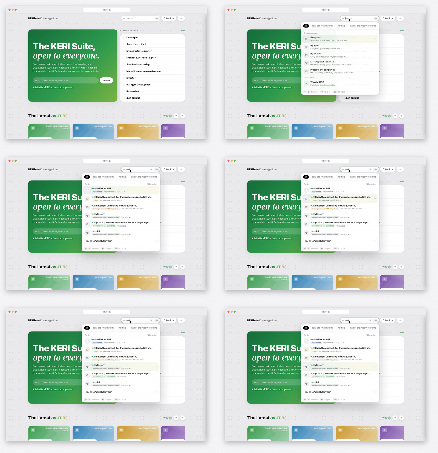
Search lives in the top bar on every page, so the answer is never more than a few keystrokes away. Results drop down right under the bar, grouped into topics, roles and cards, and the page stays usable underneath.
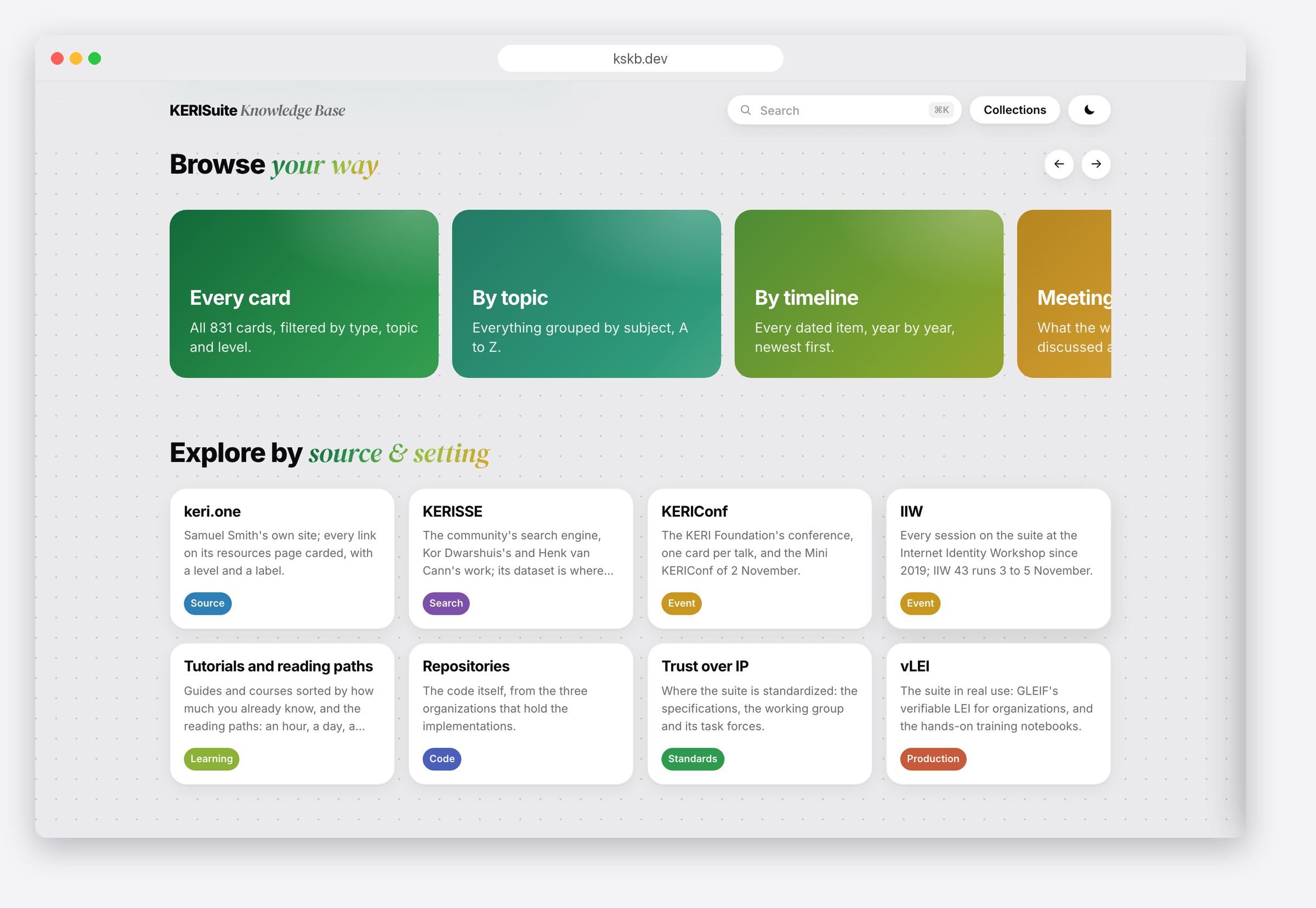
For people who don't know what to type yet, Browse your way and Explore by source give them a way in - by topic, by timeline, or by where something comes from, like GLEIF, Trust Over IP or IIW.
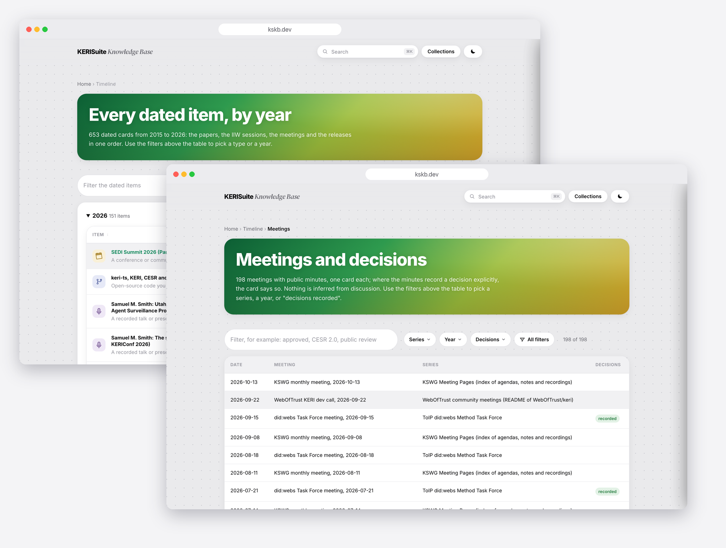
And what's new in KERI always stays on the home page: The Latest, events, the timeline and every meeting with its decisions.
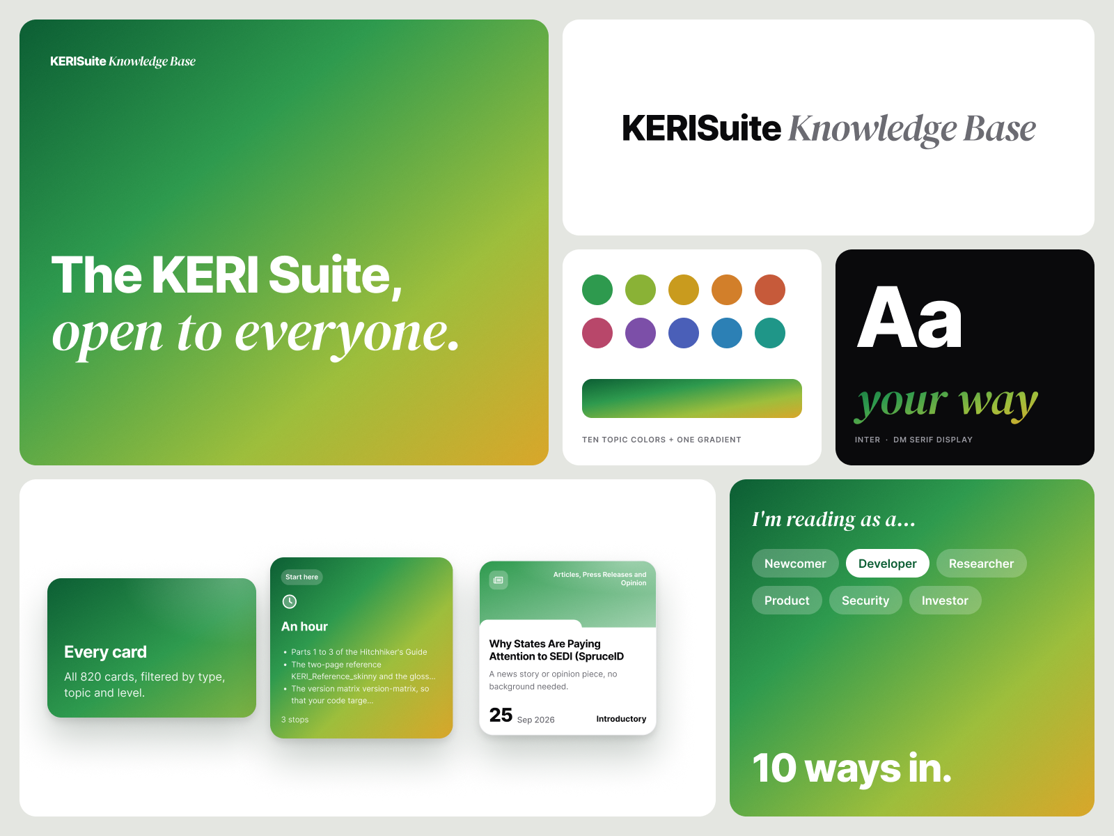
The knowledge base also needed an identity of its own, separate from any one organization in the KERI ecosystem. So I designed a new wordmark and a 16-page brand and style guide covering color, type, components, voice and copy rules. Bright gradient cards bring some warmth to really technical material, and the copy rules keep labels plain enough for a newcomer.
The same system carried through the site, the IIW 43 deck and the launch graphics, so everything reads as one.
Here's the part that still kind of blows my mind. Mark and I built the redesign together in HTML, CSS and JavaScript and shipped it to kskb.dev through reviewed pull requests, with all of his curation, data and deep links untouched. I proposed the structure in nine points, built it as four pull requests he could merge the same day, restyled the conference deck and drew the graphics - all without being at IIW myself.
Just like with SetMaat, AI tools let me plug right into the code base. The question stopped being "who can build this?" and became "what does the reader actually need?"

The week it went live, the knowledge base was recognized at the closing circle of the Internet Identity Workshop. I wasn't even in the room, and I still got goosebumps. 🥹
"Janet took a working knowledge base that looked like a spreadsheet and, in two days, gave it a design people want to read." - Mark Scott, curator of kskb.dev
Anyone can ask an AI assistant about KERI. But a fluent answer hides a lot: where it came from, how strong the evidence is, how old it is, and what it doesn't know about (drafts, reverts, things that changed last week).
KSKB doesn't compete with AI - it makes it better. Every card has a source, a label and a date. There's an llms.txt and a downloadable database so assistants can cite real cards instead of guessing, and Mark has a read-only MCP server planned. It's all open, with no sign-in, the code under Apache 2.0 and everything the base writes under CC BY 4.0.
A few things I'm taking with me:
Huge thank you to Mark for trusting me with something he's poured so much care into. 🙌 If you work with KERI - or you're just curious - go explore kskb.dev. Use it, break it, and tell us what's missing. Every card page says where to send a correction. ✨