IN AN AGE OF AI OVERLOAD, I DESIGNED INTENTIONALLY
AUTHOR /
JANET GONZALES
YEAR /
2026
I spend a lot of my time designing AI experiences, and one thing keeps coming up. Every time a team gets a new capability, it ends up on the screen. Summaries, predictions, suggested replies, alerts, scores... all at once, all fighting for your attention.
Now picture who's actually using it. A contact center agent with her headset on, a customer in her ear and a queue building up behind her. She doesn't need more to read. She needs the one thing that helps her help the person she's talking to. That's it.
So when I got the chance to dream a little with our innovation team, that's where I started. What if our copilot only showed you what you needed, right when you needed it? And honestly - what if it was a little fun?
Enter "Food Copilot." 😂 (Yes, that's really what we call it. You'll see why.)
Before UX, I spent eight years in finance doing everything from sales to running operations. So I can't help it - I look at every screen and think about what it costs. Every second an agent spends hunting through a busy page is handle time. Every distraction is a chance to miss what the customer actually said.
Here's what I wanted to get right:
1. Only what you need, when you need it - One thing at a time. Everything else stays a click away.
2. Let people tune it - The AI should learn what you care about, and you should be able to tell it what you don't.
3. Make it feel human - A little playfulness goes a long way on an eight hour shift.

Meet Maya, our agent. When she logs in, she gets a "Good morning, Maya," one place to ask the AI anything, and a quick note like "Jordan Ellis is waiting on a call. Queue is steady and you're ahead on handle time." That's really it. Her live chat sits under Now, her next customer under Incoming, and anything she promised to do later waits under Follow up.
When the bot gets stuck (like when a customer wants to change the address on an order that already shipped), Maya doesn't get dumped into a wall of transcript. She gets a one line summary and two suggested replies straight from the knowledge base, with the source linked so she can actually trust them. Send, edit or take over. Her call.
Her shift briefing is a deck of cards instead of a dashboard - drag up to approve, down to see more. And my favorite little detail is a panel called My algorithm. Copilot tells her what it's noticed ("Lately you've been focused on coaching, follow-ups, & policy changes") and she can add or remove what she wants to see more or less of.
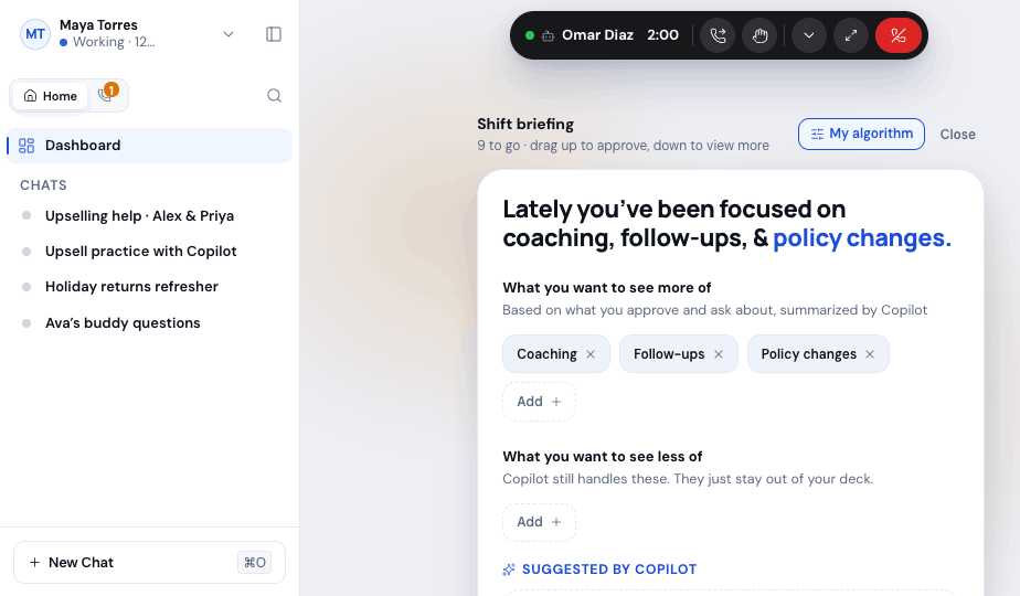
Under "less of," there's one line I'm really proud of: Copilot still handles these. They just stay out of your deck. Just because something isn't on your screen doesn't mean it's not getting done. That's kind of the whole idea in one sentence.
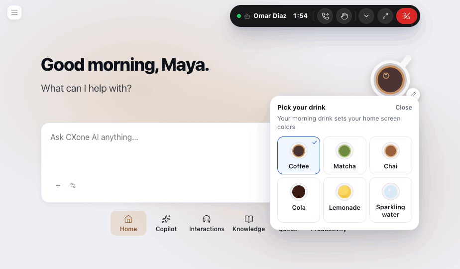
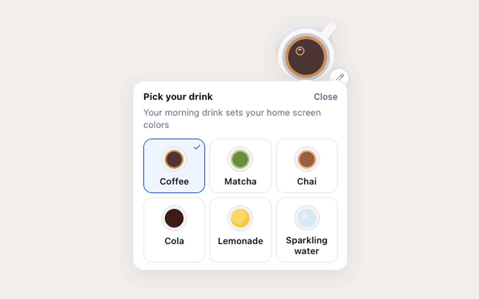
In the corner of the home screen there's a little cup of coffee. Tap it and you can pick your drink - coffee, matcha, chai, cola, lemonade or sparkling water - and it changes the colors of your home screen. Come afternoon, your hot coffee might turn into an iced one.
Is it necessary? Not really. Does it matter? I think so! Agents spend all day in this software. Giving them a small way to make it feel like theirs is a form of respect, and it makes the whole thing feel a lot less like a cockpit.
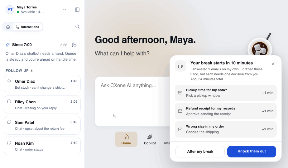
But here's the fun part. The cup isn't just cute. It's the one place on the screen where Copilot taps you on the shoulder. When Maya's break is coming up, the cup opens into a card: "Your break starts in 10 minutes. I answered 9 emails on my own. I drafted these 3 too, but each needs one decision from you. About 4 minutes total." She can knock them out now or save them for after her break. No red badges, no pop-up storm. Just one friendly nudge in a spot she already looks at.
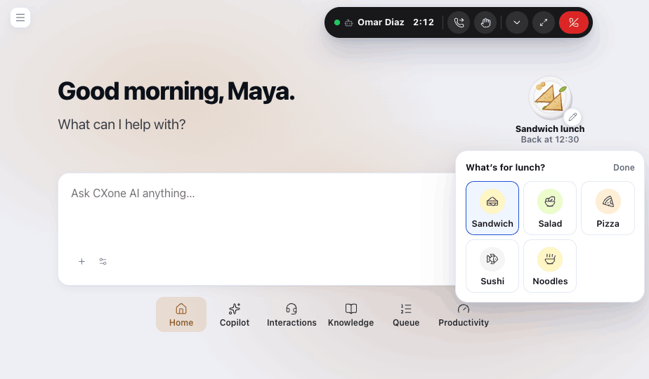
When Maya heads to lunch, the cup becomes a plate. She picks what she's having - sandwich, salad, pizza, sushi or noodles - and it shows right there with "Back at 12:30" underneath. Behind the scenes, Copilot makes sure her open chats are covered and reminds her a minute before she's due back.
Technically it's a status indicator. But "Sandwich lunch, back at 12:30" feels so much warmer than a little gray dot that says Unavailable. Her team knows where she is, and she gets to actually step away without worrying about what she's missing.

Alex, our supervisor, has a much bigger job - dozens of agents, service levels, schedules and coaching. His home screen keeps the same calm layout (and yes, the same coffee cup).
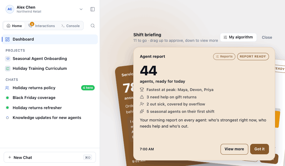
His morning briefing is a deck too, colored to match his drink. The first card is his agent report: 44 agents ready for today, who was fastest at peak, who needs help with gift returns, and who's out sick and already covered. One card instead of five reports. He reads it, taps Got it, and moves on.
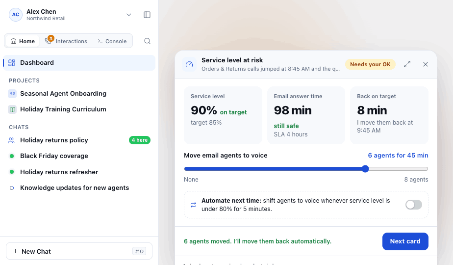
When something goes sideways, Copilot brings him a decision, not a dashboard. If service level is at risk, the card shows what happened, a slider to move email agents over to voice, and a promise: "I move them back at 9:45 AM." He approves it, and there's even a toggle to automate it next time. Copilot proposes, Alex decides, and over time he gets to choose what he hands off for good.
And when a chat needs his attention? The coffee cup turns into a green chat bubble with the customer's name. One tap and he can whisper to the agent, take over or transfer, with Copilot's summary right there.
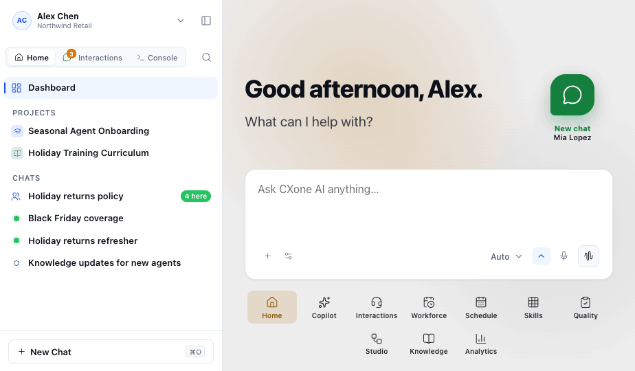
I'll admit, going into this I thought the hard part would be fitting everything the AI could do onto the screen. It turned out to be the exact opposite. The real work was deciding what to leave off, and then finding a gentle (and hopefully delightful) way to bring it back at the right moment.
A few things I'm taking with me:
Huge thank you to our innovation team for letting me bring a little coffee (and lunch) into enterprise software. 🙌 If you're thinking about AI and information overload in your own product, I'd genuinely love to chat. ✨