
A fighting union with a need for an optimized user experience.
Alphabet Workers Union union strives to protect Alphabet workers, our global society, and our world. They strive to make sure Alphabet acts ethically. They consulted with the Auddities team to improve their branding and web experience.
My Role
I worked as the User Experience Designer on this project, as well as the sole UX Researcher. I worked with Audrey Desler (Project Lead and Creative Director) and Madi Graham (Visual and Web Designer), along with the AWU team.
My work included:
Content/UX Audit of existing website
User Interviews (for branding and UX purposes)
Wireframing and Prototyping
Collaboration with executive board members, union staff and communications director on design and direction.
Information Architecture
User Testing
Timeline: April 2023-July 2023


A photo of the old AWU website.
Reviewing the current website
I started out with a UX audit of the current website, reviewing how we could improve it. I also interviewed union members to understand their experience.
Some of the trends in user thoughts are below:
Difficulty finding basic information
“The website should answer these questions: what is a union? how much does it cost? and, most importantly, what has AWU accomplished?”Consolidation for easier access
“Consolidate things that go together. Posting on the forum could all be under one tab. Messaging applications all under one tab. Resources all together…”Sharing Wins that can be used as talking points
“I want to know concrete details like plans, recent wins, values, details.”
After speaking with current, prospective and long-time union members, it became clear that the website at times was difficult to navigate and, in turn, made it difficult for others to understand and complete key tasks like joining the union, viewing talking points to spread the word and identifying the latest union events.
Identifying business goals
I interviewed a total of 16 people (experienced and new union members, all levels of activity, including board members). In this process I created the test script and made sure that I understood how union members found out about the union, what they reviewed to become a member, and also how they use it on an ongoing basis.
I also asked users to complete tasks and give us overall impressions of the current website in order to benchmark usability in our revised website. Tasks included:
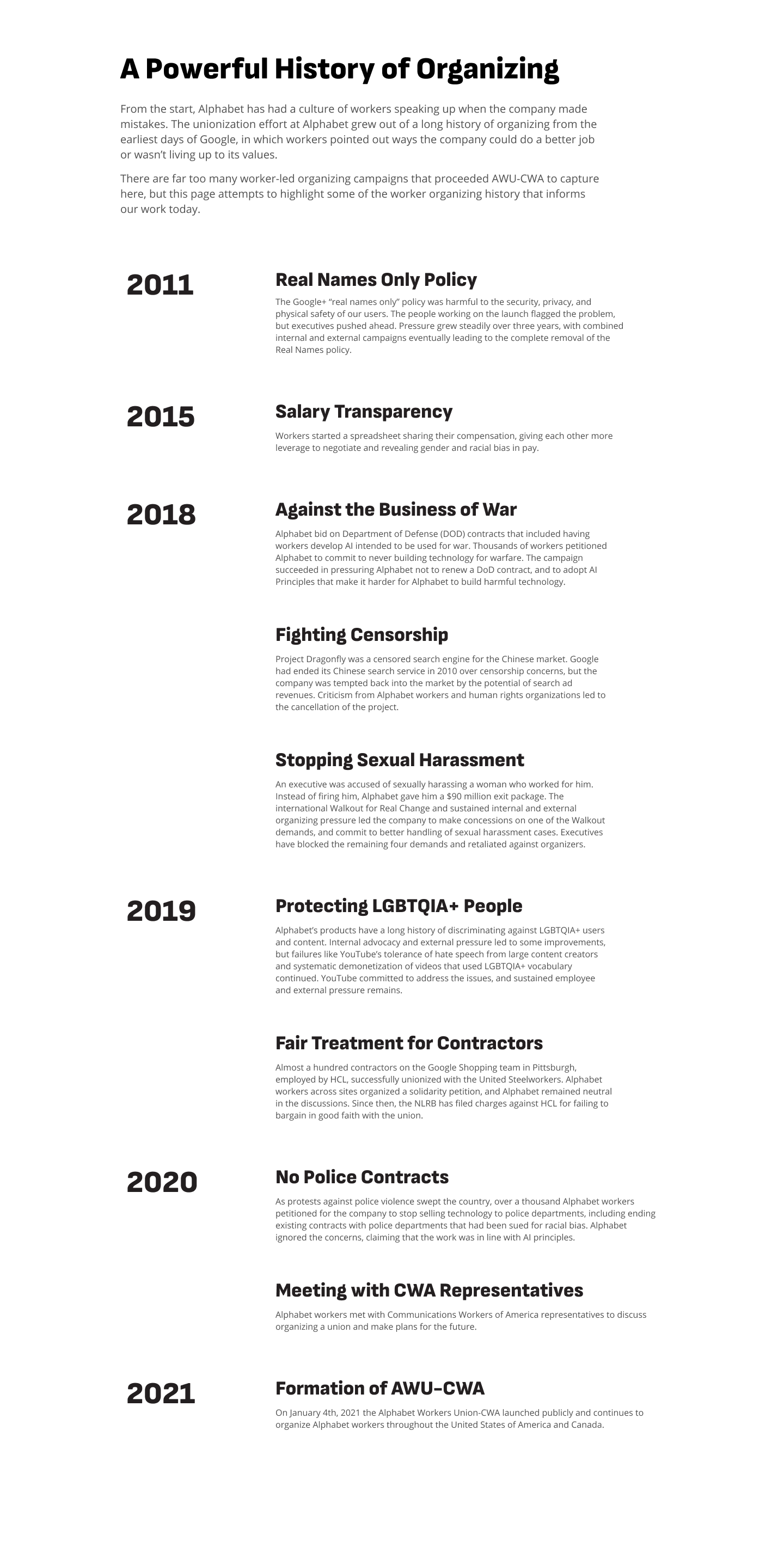
Locating AWU’s wins
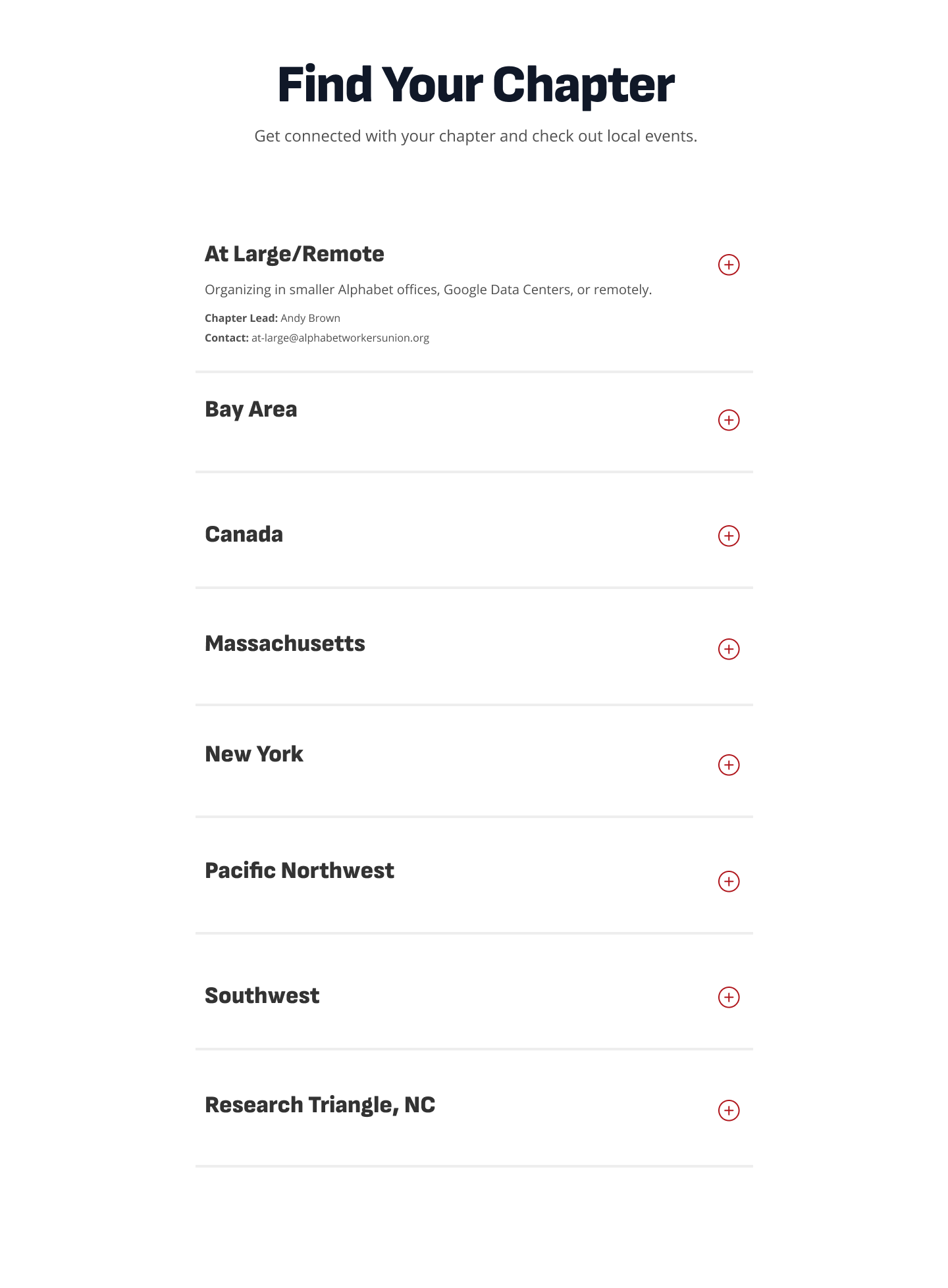
Finding their local chapter
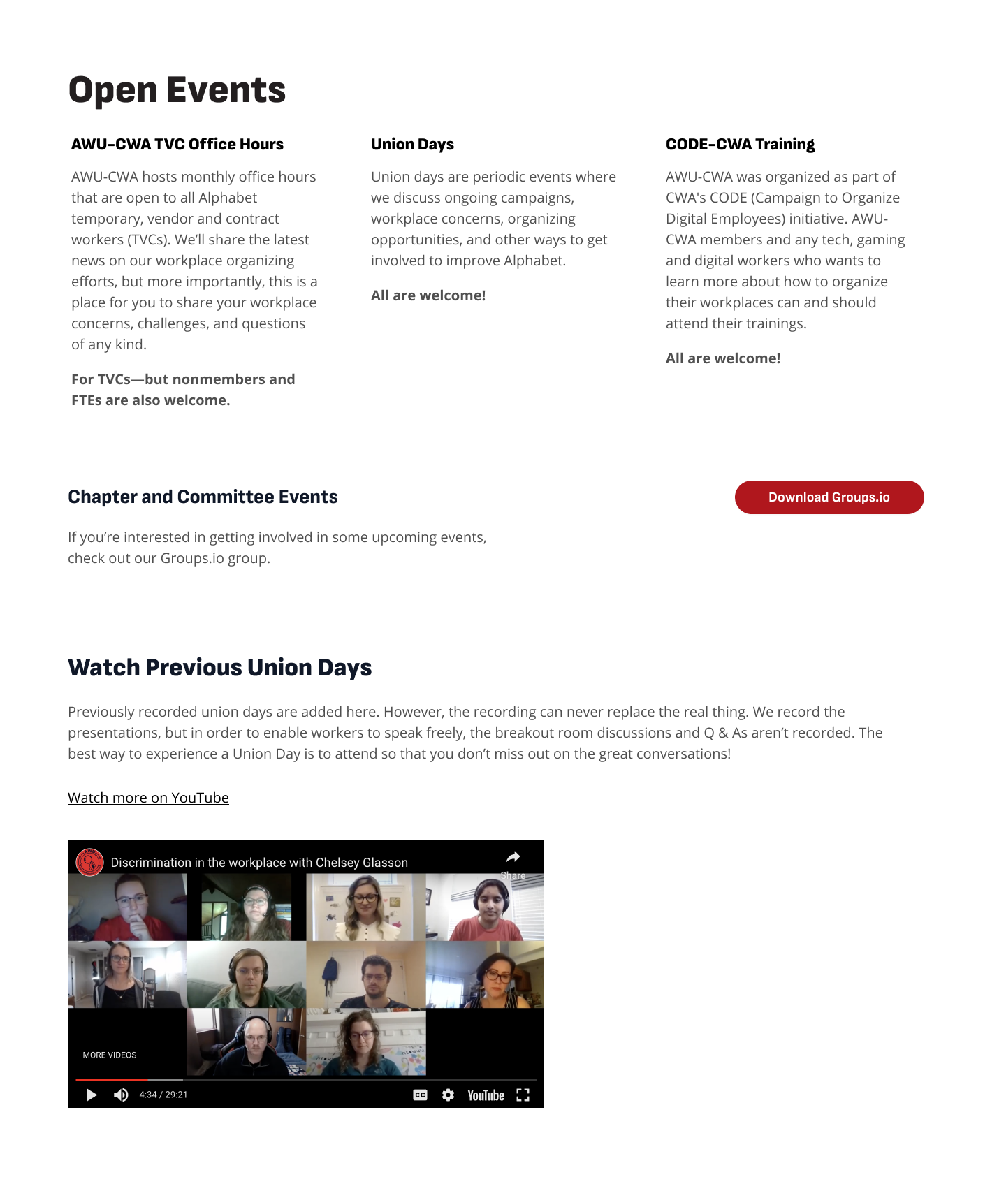
Finding the next union event
All three tasks were difficult for users to complete. At that point in time, there was no list of local chapters, there was not enough detail about union events to know what they were about, and while AWU’s wins were accessible they were not in the most intuitive place.
Creating objectives from User Interviews
From my conversations with union members, board members and employees, I created business goals that helped inform and influence my UX designs. These included:
Making it easy to take immediate action and join the union
Easy access to Local Chapter Contact Info - This would help boost engagement and connection in their immediate area.
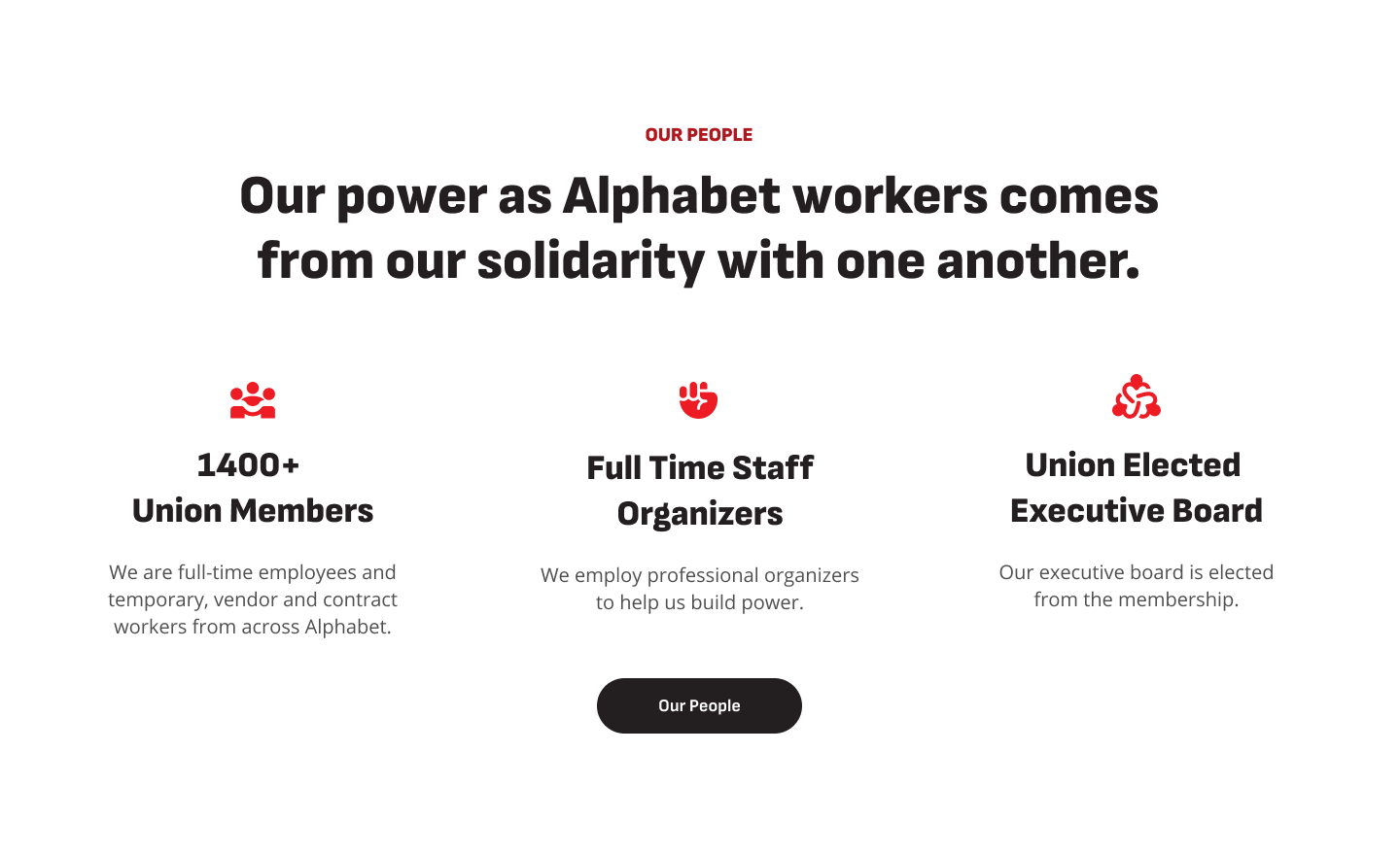
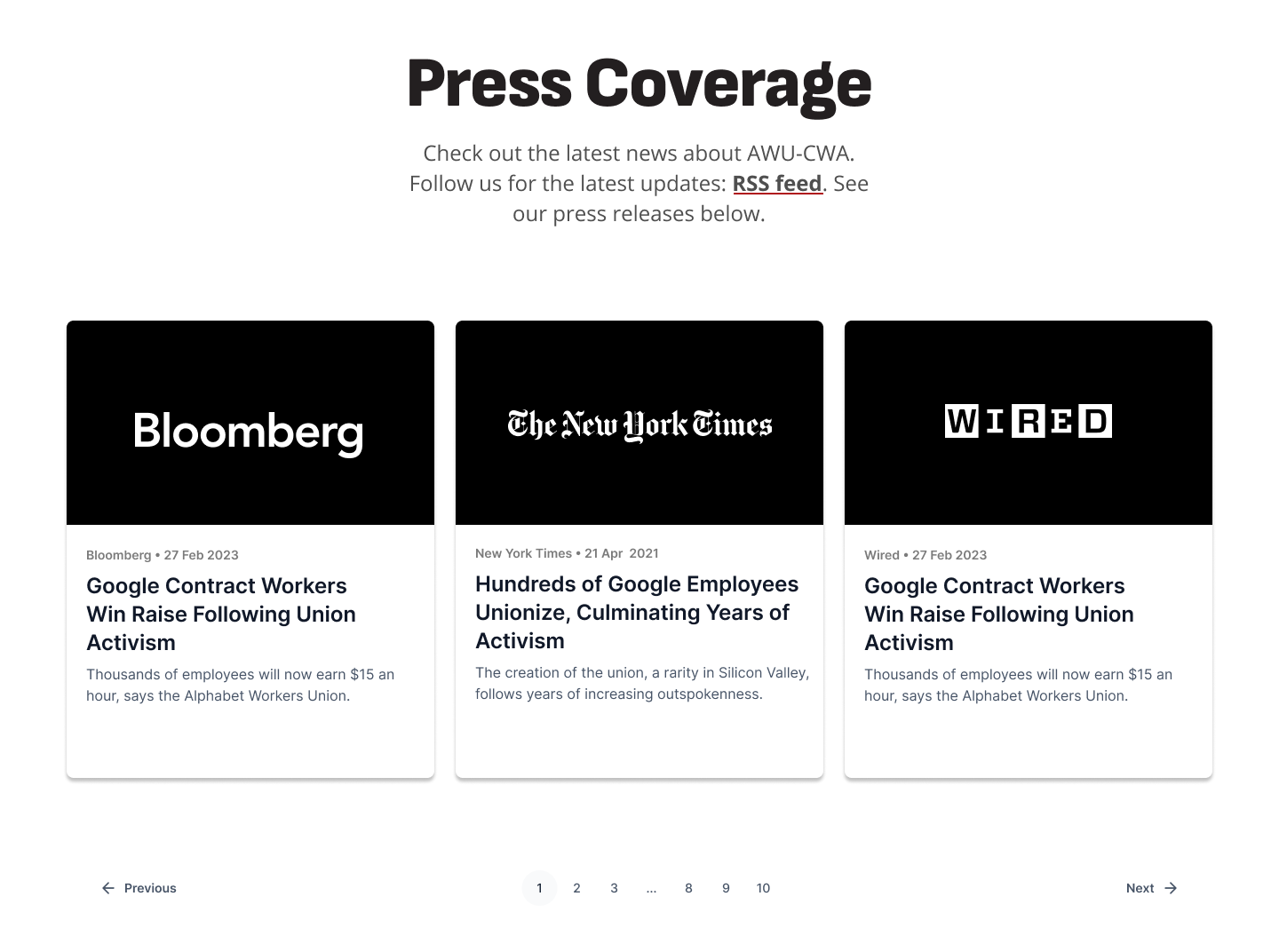
Ensuring union wins and press coverage were both prominent and very accessible. Many union members reported joining the union through a friend, the positive press coverage and reputable sources, as well as the knowledge of union wins would empower current union members in their conversations with prospective union members.
Making the website more intuitive through sitemapping
Madi and I created a sitemap to identify how best to organize the data. Using guidance from our user research, we aimed to highlight wins, consolidate where possible, and make the sections more intuitive.
Some of the parts of pages that we created ahead of final wireframes.
Balancing the needs of users and stakeholders
During the design process, user needs came up that at times required a creative solution. Some of these included:
How can Contractors and Full-Time Members both feel welcomed as prospective and current members of the union?
We heard from some contractors that they didn’t feel the website represented “them” we worked with union members. We took this feedback and made sure that where we could, we clarified contractor eligibility, we also brought forward union members that were contractors in our web pages, and also brought contractors into the user testing process.
How can we improve upon the join experience?
The form used was cumbersome and hard for contract workers to follow. At this point in time, the stakeholders were not open to including the form as part of scope, but we created a join page that detailed reasons to join and what it entails, and they added a contact email so that anyone having issues completing it could reach out.
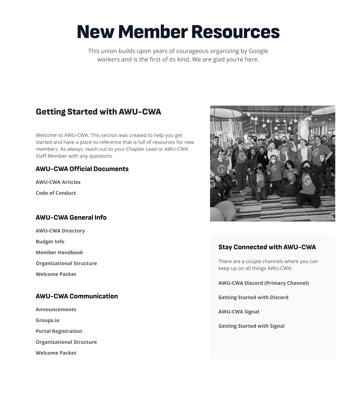
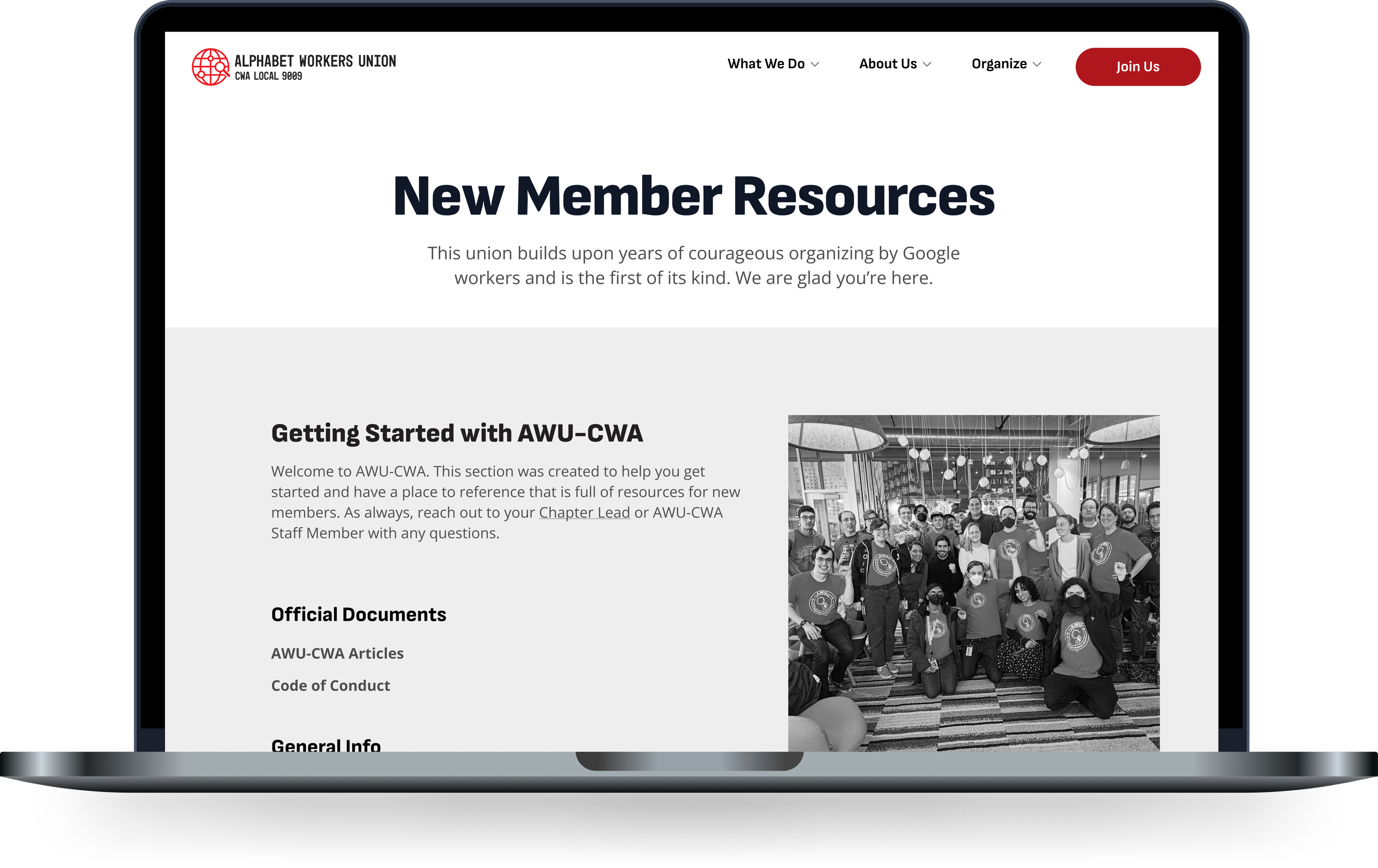
Where can New Members go to get started?
Union members wanted transparency into union spending, meeting minutes, discord chats, etc. but Union Board and Staff wanted to keep this private (between union members only). We created a webpage (New Member Resources) that included quick-links that worked for union members, as well as crucial and public information for new members.

User Testing
I created a test script for our users and had them navigate through the website and prioritized fixes given the time constraints that we had. One of the high priority items, updating the form, was not completed in MVP, but will be completed in the future.
When completing these tests, 90% of participants were able to locate wins, 100% could locate where to join, and 80% could find their chapter, a huge increase from the roughly 50% task completion rate in the prior user interviews.
Users also appreciated that both full-time workers and contractors were featured, that contact information was prominent, and that there was a very easy way to see union wins.
Final Designs


Reflection
I really enjoyed working with the Alphabet Workers Union, their passion and excitement for their work was contagious. I appreciated that they were willing to follow the full UX process and they were open and receptive to the feedback of their users. Many of our identified issues were fixed, and those that were not are supposed to be updated at a later date.
Something I would have changed is identifying the limitation of the “Join the Union” form earlier on. Many of our users said it was at times difficult to use for contractors since a lot of the questions did not apply. While we surfaced UX recommendations, tech limitations and time constraints prevented us from completing a full overhaul.
Overall, however, we did achieve our goals of making a more easy to navigate website, highlighting union wins, and making it as easy as we could (taking constraints into account) for others to Join the Union.